Weeknotes – series 01 episode 03
- Author Benjy Stanton
- Date
- Categories
Featuring service design, accessible maths symbols and pizza. If you only read one bit, read the bit on service design training.
Monday
Review user research
We got together after morning stand-up to review the user research findings from Alison's recent trips. It's always a popular slot, but it was good to involve people from the editorial team and graphic design team. (Breaking down silos!)
Future of research and design
The lead user-centred design people met with Sam in her new role as Chief Digital Officer to talk about plans for the future of our teams. It was good to see Sam is open to new ideas but also pushing back on us to gather evidence for the changes we want to make.
Stickers!

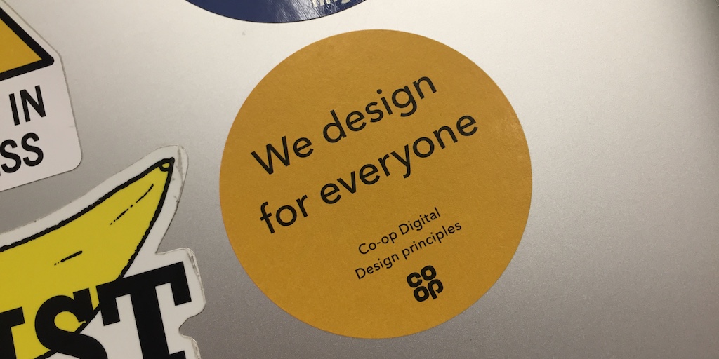
Andy brought back co-op design principle stickers from his conference in Manchester.
Hiring a user experience designer
The advert to hire a user experience designer to replace Tom went live! No-one can replace Tom obviously – but we have to try.
Tuesday
Design sprint next steps
We got together to chat about next steps for the bulletin prototype. We're planning a one day workshop to create iteration 3 of the prototype ready for the next round of usability testing. It should contain more realistic content thanks to the work of Kieran and a more flexible "at a glance" section at the top thanks to Rachel.
User experience design lead catch-up
Me and Ben chatted about whether we'll use Fractal for the next iteration of the pattern library or not. Hint: probably will.
Prototypin’
I spent most of the day doing some prototyping for the "publish a dataset" task that our publishing team will be using. The exercise was useful, but made me realise I had to take a step back and understand user needs and technical processes in more detail.
Wednesday
Cross site working
Wednesday I had a couple of meetings with the Census team based in Titchfield. We need to figure out how the designers there can work with the team here in Newport and support each other with consistency, accessibility and ways of working.
Accessible maths symbols
I had a quick meeting with the website publishing team to check if we can add minuses (not hyphens) to website content (we can). Using a minus is supported by the GDS content style guide.
It's more likely than a hyphen to be read out as "minus" by screen readers. It's wider so it might be easier to read (hypothesis). The drawback is it's more difficult to type and will require manual checking. Seems like a lot of effort, but if anyone should be getting maths symbols right it should be us.
Related: we noticed that our equations are inserted as outlined SVG shapes, so they are effectively invisible to assistive technology.
<g role="img" aria-labelledby="title">
<title id="title">FISML=(r−Rt)SL</title>
...
</g>
But this is just a proof of concept and doesn't consider how we'd turn this into a functioning tool that could be used by the publishing team.
Thursday
Thursday was a loooong day. I got the train in because I needed to get the train straight to London after work.
Interactive calculators pattern library
Me and Matt got together in the morning to review progress he's made mocking up the pattern library for our interactive calculators. This should lead to more consistent, usable and accessible content for our website and I'm really excited by the progress being made.
Design review
We had our regular design review (my fav meeting of the week). Carlie showed this neat data viz thing that Go Compare have made called You and planet earth.
Front-end dev and user experience (UX) design reviews
We decided to introduce twice weekly slots for the front-end devs to get together with ux designers to review work-in-progress. This will help us to have more opportunities to chat and also reduce the distraction of ad-hoc meetings that break us out of our workflow.
This is in addition to the regular demo slots we have after morning stand-up and sprint show and tells.
Card sorting with the publishing team

We did a card-sorting exercise to help us figure out how to:
- help the publishing team find pieces of content
- prioritise the elements on the page
- name the pages and sections
London

After work I went straight to Newport station and caught the train to London ready for my training on Friday. Went for a lovely dinner in Pizza Union thanks to Tom's recommendation.
Friday
Service design training

I was in London for my 'intro to service design training' at GDS with Clara and Martin. It was really, really good.
The key takeaways were:
- service design tools are easy to pick-up (like this one: service walkthroughs)
- you don't have to be an expert to start doing it
- service design helps you to ask 'why?'
- service design helps us to rephrase problem statements so we're meeting user needs
- design the end-to-end process (and think about what happens before and after the service)
- design the things the user can't see (not just the front-end touch-points)
- design across channel (digital, face-to-face, phone, letter, email)
- service design is great for facilitating discussions and creating shared understanding with stakeholders
- service design can help you make sure you are building the right thing
You can see me being trained in the art of service design in this tweet.