Making responsive HTML emails
- Author Benjy Stanton
- Date
- Categories
This is a run down of my process for designing, building and testing responsive HTML emails. I’ve also included lots of links to articles and resources for further reading.
Starting with the Client Brief
If you are lucky like me, you’ll have a client who will supply you with an initial brief.
These usually include…
- the main objective of the email
- the target audience
- an early draft of the content
- guidance on potential photography
- ideas about potential design style
(Hopefully it goes without saying that writing the content and defining a marketing strategy for an email is a whole other task that won’t be covered in this article).
The Content
This is an example of the kind of content that a typical email might include…
- Logo
- Main image
- Heading 1
- Paragraph (or two) of body copy
- A main call to action (CTA) button
- Contact details
- Social media icons
- Small print
- Unsubscribe link
- View in a browser link
What Email Clients Are Your Users Using?
It’s worth trying to find out as much information as you can about the recipients early on, as this will effect the design as well as the build.
If your audience are using modern email clients you might want to try some cutting edge techniques like moving images or web fonts.
The bad news is, despite community efforts the state of email standards is a lot worse than the state of web standards. And many very popular email clients (like Gmail) are reluctant to get on board with a consistent approach.
The reality is you will probably need to support a range of web, mobile and desktop clients, including the notorious Outlook (which incase you don’t know, is like the Internet Explorer of email clients).
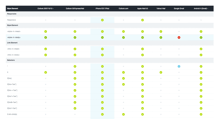
Once you know what email clients you need to support, this guide from Campaign Monitor is really useful for checking what CSS is supported by various email clients: The Ultimate Guide to CSS.
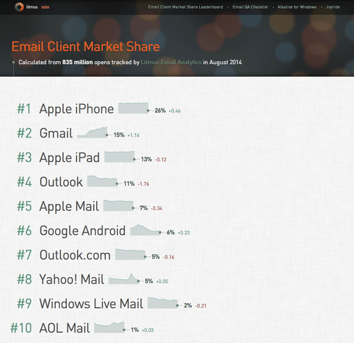
If you can’t get any information about what email clients your users have, then this website from Litmus lists the top 10 clients according to their analytics: Email Client Market Share. You’ll notice that ‘mobile’ makes up a big chunk of users.
Sketching
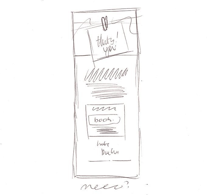
Once I’ve got the brief, I like to scribble all the elements I need on a piece of paper. First I’ll just list them, marking them up as h1, paragraph, call to action, small print etc.
This helps me to develop a hierarchy and a source order. And, by initially limiting myself to a single column, it forces me to think in a mobile-first kind of way.
Next, I’ll begin to sketch a layout, slowly grouping the elements together into a very rough design.
Designing
If this is the first ever campaign, or the design is a big departure from previous campaigns, then I’ll jump into Photoshop (or whatever) at this point to mock-up a concept. This is useful for me as it helps to experiment with and gather any fonts, colours and imagery etc that I’ll be using.
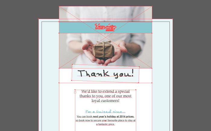
If you are comfortable working directly in the browser than do that, I think that whatever is the fastest and most comfortable way for you to begin iterating on the design is the best route to take.
How Big Should an Email Be?
Although it’s becoming less clear cut with responsive design, I still like to design my emails at around 600px wide.
Because I’ve already sketched out my source order, I have a good idea how things will look on mobile too, so I don’t spend any time mocking things up at different widths.
In terms of email height (and file weight) I think the smaller the better is a good rule of thumb. Your content should be focused and concise and this in-turn should result in a small email.
Keep Things Simple
My advice would be to keep things simple, just because we might be working with a 12 column grid, doesn’t mean we should use every one.
Complicated designs take a very long time to test once built. And more importantly, at 600px wide, any more than 2 or 3 columns of text is unlikely to give a comfortable read and is going to start to feel very cramped.
The Inbox
Don’t forget how cluttered many email clients can be, don’t let your complicated design contribute to the noise. Your users probably don’t want to waste time and effort reading your email. So my recommendation would be to design with 1 column and plenty of space between elements to make things as easy as possible.
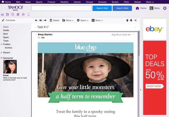
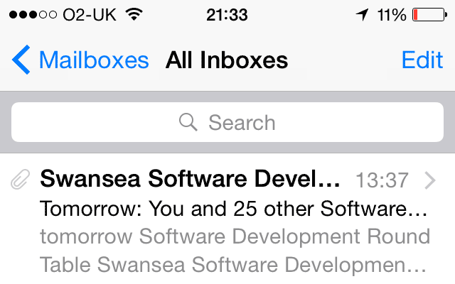
Consider also how the email copy will read in the inbox view too. The user may be presented with just the name of the sender, the subject line, and just a few words from the beginning of the email, before they decide whether to read it, swipe it straight to archive, or even worse, mark it as spam.
Spam
On the note of spam, I’d urge you take it seriously and please don’t bombard people. If you’re interested in learning more about the rules and regulations this is a good starting point: Spam Lawsuits (by MailChimp).
Build
Choosing a Framework
Personally, I’m not a huge fan of using frameworks to build websites, but when it comes to emails, there are so many hacks and gotchas that trying to build something from scratch, even if you are familiar with HTML and CSS will probably send you crazy.
As I’m sure most of you know, HTML emails are built with tables instead of divs for layout. And for fine-grained control over things like spacing, you may even need to put each heading and paragraph in their own table cells too.
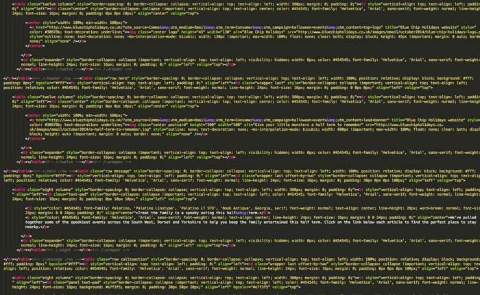
This results in horribly bloated code. And that’s before you’ve added all the CSS inline (we need to do this because Outlook and Gmail strip out CSS from the head).
Ink
The framework I currently use is called Ink, which was created by Zurb, the people behind the Foundation framework.
Ink has a 12 column grid, that drops to a single column below 600px. They have an inliner on their website which lets you build your email in a more traditional way (i.e. keeping the HTML and CSS separate). Then the inliner can be used to process your code, and inject the relevant CSS around each element.
Once you’ve learnt how to use Ink’s grids, buttons and panels etc, then the actual build is fairly straightforward. If you get stuck then they have some great documentation available.
Other Tools, Frameworks and Approaches
- Antwort Responsive Layouts for Email
- Transactional HTML Email Templates
- Canvas
- Bulletproof email buttons
Testing
Testing is the most difficult and tedious part about building an email. Even when using the Ink framework, I find that three quarters of my entire time on a project is spent debugging layout issues. Luckily there are lots of tools and resources out there to help.
Once my email has been designed, built and processed with Ink’s inliner (to bring the CSS inline), I’m nearly ready to begin testing.
Before Testing, Don’t Forget to…
- Proof read of the copy
- Double check phone numbers and email addresses (in the markup too)
- Check you’ve included alt text and titles attributes where appropriate
- Remove any unused CSS (frameworks are notorious for adding bloat)
- Optimize images
- Check your email with images turned-off
- Update images to have absolute paths
I usually stick the images in my Dropbox public folder while testing. Many ESPs (Email Service Providers) will have the ability to host your images too.
Note: I’ve noticed that certain imageproxys (like Outlook.com’s) will refuse to load images from certain sources. I don’t pretend to understand why this happens, but if it does, try hosting your images somewhere else.
Using MailChimp to Send Test Campaigns
This is where MailChimp comes in for me, you can sign up for a free account and use it to send tests to a few personal accounts.
Currently, I Test on the Following Email Clients…
- Gmail.com (Chrome, Firefox & Internet Explorer)
- Outlook.com (Chrome, Firefox & Internet Explorer)
- Yahoo.com (Chrome, Firefox & Internet Explorer)
- AOL.com (Chrome, Firefox & Internet Explorer)
- iPhone 5c
- iPad
- Mail (OSX)
- Thunderbird (OSX)
- Outlook (Windows)
- Windows Live Mail (Windows)
The last email I did took about 15 tests before I was happy with it. Testing the same design 15 times on multiple email clients can get pretty demoralising, so to help ease the pain I created this handy PDF for testing email clients.
Debugging Common Problems
In my experience, inspecting the code is rarely useful (and not always even possible). So the best route when you find a problem is to search the web.
Here are a few common ones…
- Use CSS Attribute Selectors to stop Yahoo rendering your media query styles
- Use
!importantin your mobile media queries, to make sure the styles override the inline desktop styles - Use
<span>to style blue links on iOS - Use
<td>and padding to get reliable spacing around chunks of text - Use
vspace="10" hspace="10”to get padding around images in Outlook
The Litmus and Email on Acid blogs are usually the best place to find solutions to problems.
Virtual Testing with Litmus (via MailChimp)
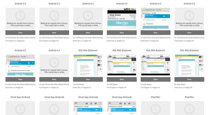
Once I’m happy with the design in the email clients that I have direct access to (it doesn’t need to be pixel perfect), I will run some virtual tests for good measure. These services allow you test in a whole raft of Email Clients (40+) which is pretty difficult to achieve without access to a comprehensive Device Lab.
There are two email testing services that I would recommend…
Rather than use these services directly, I use a feature via MailChimp called Inbox Inspection. This is powered by Litmus, and if you have a free MailChimp account, it only costs $3 per test which can work out cheaper than a monthly subscription.
Conclusion
I hope you found this write-up of my email design process useful. It’s worth reiterating that you should keep the design as simple as possible and leave plenty of time for testing. If you have an further questions, please feel free to ask me on Twitter.
Lastly here are some further resources to keep you busy…
Design Inspiration and Further Reading
Subscribe to Some Emails
Last of all, I find the best way to stay up-to-date with techniques and best practices is to subscribe to newsletters from the experts. These guys (as you might expect) have consistently great emails…